A website is often judged by its appearance, content, and ability to convert. People use these factors to assess your product, marketing team, and your business’s authority in the niche. As a result, companies tend to focus on design and content—but often overlook one crucial element: website accessibility.
Without accessibility, even the best-looking, most informative website can fail its users.
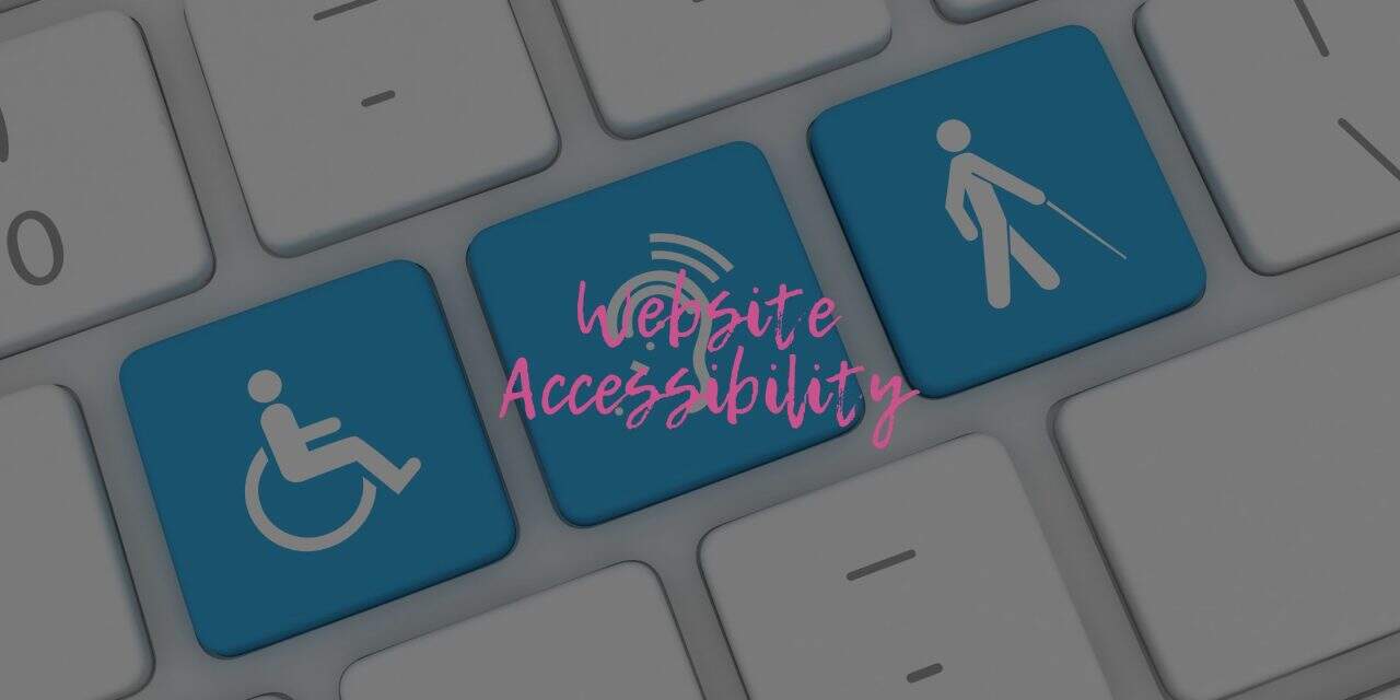
Website accessibility ensures that everyone, regardless of physical or cognitive ability, can navigate and interact with your site. In this article, we’ll explore what website accessibility means, the standards used to measure it, and practical steps to improve your site’s inclusivity.
What Is Website Accessibility?
Website accessibility means developing and maintaining a website that anyone—whether disabled or not—can access, understand, and use. It ensures your content can be perceived and interacted with by all users, including those using screen readers or browsing without video or audio support.
It also includes designing tools, dashboards, and databases that everyone can operate. For that to happen, everything must be perceivable, operable, understandable, and robust—the four core principles outlined in the Web Content Accessibility Guidelines (WCAG).
🔧 The 4 Principles of Website Accessibility (WCAG)
1. Perceivable
Your website content must be visible and understandable through users’ senses—whether through sight, sound, or assistive technology.
-
Blind users should receive a similar experience via screen readers.
-
Text should be legible for sighted users, and your color choices should not cause eye strain.
The goal is to ensure that all users—regardless of ability—can perceive the information you present.
2. Operable
Your site should be fully navigable and interactive for everyone.
-
The user interface (UI) and navigation should be intuitive and usable with both mouse and keyboard.
-
All users should be able to complete key actions—like submitting a form or clicking a call-to-action.
If your site isn’t operable, visitors with motor or vision impairments may struggle to take the next step.
3. Understandable
Content must be written clearly and simply so all users—regardless of educational background—can understand it.
-
Blog posts, instructions, and forms should use plain language.
-
Navigation labels and error messages should be easy to interpret.
The simpler your language, the broader your audience reach.
4. Robust
Your site should be built using modern technologies that are compatible with both current and future assistive tools.
-
Screen readers should consistently work, even after platform or browser updates.
-
HTML, CSS, and JavaScript should follow best practices for accessibility.
A robust site is one that’s future-proof and inclusive by design.
🌍 Why Website Accessibility Is Essential
You might think of website accessibility as a nice-to-have feature—but in reality, it’s a must. Accessibility doesn’t just help users with disabilities—it improves usability for everyone and can directly impact your legal standing, website traffic, and revenue.
Let’s explore the key reasons why website accessibility should be a top priority:
1. It Helps You Avoid Lawsuits
Yes, your business can be taken to court if your website is not accessible. Under the Americans with Disabilities Act (ADA), websites are considered places of public accommodation. If your site is difficult for people with disabilities to use, you may be charged with discrimination.
Even large companies like Nike have faced legal action for failing to provide accessible websites. These lawsuits are costly and damaging to brand reputation. The takeaway? Don’t wait for legal trouble—build accessibility into your website now.
2. It Brings More Traffic to Your Website
The internet is meant to be inclusive. People with disabilities often rely on assistive technologies like screen readers, text-to-speech tools, and keyboard-only navigation to access websites.
If your site is accessible:
-
More people—including those with visual, auditory, or cognitive impairments—can use it.
-
You’ll likely outperform competitors who haven’t prioritized accessibility.
-
You broaden your audience and open doors to new potential customers.
3. It Boosts Your Sales Revenue
An accessible website doesn’t just benefit users—it benefits your business.
Every visitor becomes a potential customer when your content is usable and navigable by all.
For example:
-
A visually impaired visitor can use a screen reader to browse your product pages.
-
Someone with motor disabilities can complete your contact form using a keyboard.
-
A person with cognitive disabilities can understand your call-to-action and place an order.
Accessibility leads to inclusivity—and inclusivity leads to more conversions.
4. It Improves SEO and Visibility
Here’s a bonus: most of the things you do to improve accessibility also enhance your search engine optimization (SEO).
That includes:
-
Using proper heading structures
-
Writing descriptive alt text
-
Labeling links accurately
-
Improving site speed and mobile responsiveness
Search engines reward websites that are well-structured and easy to navigate. So when you make your site accessible, you’re also making it more discoverable.
🛠️ How to Improve Your Website Accessibility
Improving accessibility doesn’t require a full website overhaul. In fact, small, intentional changes can go a long way. Whether you’re building a new site or updating an existing one, these steps will help make your content inclusive and compliant with accessibility standards.
1. Choose the Right Content Management System (CMS)
Your content management system plays a big role in how accessible your site can be. A good CMS allows for structure, flexibility, and built-in support for accessibility features.
Popular CMS platforms like:
-
WordPress and Wix offer plugins and themes that support screen readers, alt text, and keyboard navigation.
-
Drupal and Squarespace also offer accessible templates, but always double-check before committing.
Theme selection matters.
Look for:
-
Support for semantic headings and keyboard navigation
-
Editable tables and captioned video players
-
Documentation that mentions accessibility compliance
The right CMS and theme provide a strong foundation for building an inclusive site.
2. Organize Your Headings Properly
Heading tags are more than just styling tools—they structure your content for both users and screen readers.
Best practices:
-
Use only one
<h1>tag per page (the page title). -
Follow a logical structure:
<h1>→<h2>→<h3>, and so on. -
Never skip heading levels (e.g., don’t jump from
<h1>to<h3>).
Proper heading structure:
-
Makes your content easier to skim
-
Helps screen readers navigate more efficiently
-
Improves SEO
3. Use Alt Text for All Images
Alt text describes the content and function of images on a page. It’s essential for users who rely on screen readers.
Guidelines:
-
Use meaningful, descriptive alt text.
-
For infographics, summarize the main message.
-
For photos, describe the scene or action shown.
-
If the image is decorative, use empty alt text (e.g.,
alt="") to avoid clutter.
This allows visually impaired users to understand your visual content just like everyone else.
4. Use Descriptive Link Text
Avoid vague phrases like “click here” or “read more.” Instead, tell users exactly where the link goes.
Example:
-
❌ Click here
-
✅ Try SEMrush’s Link-Building Tool
Also, when linking internally, use helpful anchor text like:
“Learn more about our team on the About Us page.”
This improves accessibility for screen reader users and helps SEO by reinforcing keyword relevance.
5. Use Colors Appropriately
Colors play a key role in user experience—but they must be used with care.
Best practices for color accessibility:
-
-
-
-
-
Maintain strong contrast between text and background.
-
Avoid using color as the only indicator of meaning (e.g., don’t rely solely on red to indicate an error).
-
Use simple, clean color combinations to reduce eye strain.
-
-
-
-
Important note:
About 8% of the population has some form of color blindness. Also, users with cognitive or learning disabilities may rely on color cues to understand content—so always pair color changes with text-based indicators.
Example: If a user enters the wrong password:
-
-
-
-
-
Change the border color to red and
-
Display an error message like: “Incorrect password. Please try again.”
-
-
-
-
This dual approach ensures everyone gets the message—regardless of how they perceive color.
6. Use Easy-to-Read Fonts
Stylish fonts may look cool, but they often compromise readability.
Font tips for accessibility:
-
-
-
-
-
Choose simple, sans-serif fonts like Arial, Open Sans, or Roboto.
-
Avoid overly decorative or script-style typefaces.
-
Use consistent sizing and spacing.
-
Stick to short, clear sentences.
-
-
-
-
Studies show that hard-to-read fonts lower trust and comprehension. And remember—screen readers don’t “see” fonts, but users do.
Writing in plain, accessible language helps ensure your message is understood by a wide audience, including those with reading challenges or non-native English speakers.
7. Make Your Forms Accessible
Forms are often where accessibility breaks down—but they’re also where conversions happen, so they must be inclusive.
Form accessibility tips:
-
-
-
-
-
Use clear labels for every input field (e.g., “Email Address”).
-
Avoid relying solely on asterisks (*) for required fields—some screen readers don’t announce them.
-
Instead, say something like: “Fields marked with an asterisk (*) are required.”
-
Group related fields together (e.g., personal info vs. billing info).
-
Use both color and text to indicate errors after form submission.
-
Skip CAPTCHAs—they’re often inaccessible. Use alternatives like honeypots or email verification instead.
-
-
-
-
Making your forms user-friendly for all improves your completion rate and customer satisfaction.
8. Ensure Keyboard Navigation Works
Not all users rely on a mouse. Many use keyboards—or even assistive tech like switches or voice commands—to navigate.
To support keyboard-only users:
-
-
-
-
-
Make sure every interactive element (buttons, links, form fields) is accessible via the Tab key.
-
Use the Enter key to activate links and buttons.
-
Ensure visual focus indicators (like outlines or highlights) are visible during navigation.
-
-
-
-
If a user can’t navigate your site with just a keyboard, it’s not fully accessible.
✅ Conclusion: Accessibility First, SEO Second
Before worrying about design flair or SEO tricks, make sure your site is usable by everyone. A beautiful, fast, SEO-optimized website means little if your visitors can’t read, navigate, or interact with it.
Accessibility is not a one-time task—it’s an ongoing commitment to inclusivity. By implementing the strategies above, you’re not only avoiding legal risks but also creating a more user-friendly, high-performing website that serves all your potential customers.


